
Descriptions for image cards are best kept short
Cards
Cards briefly describe and link to a piece of content.
These are very useful for landing pages that guide users to content further down. You can use image-based or text-based cards depending on your needs.
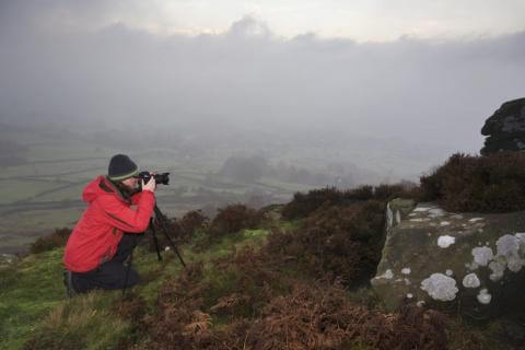
Image Guidelines
- Recommended Size: 758 x 352 pixels
- Aspect Ratio: 379:176
- File Size: Under 300 KB, if possible
Tips on images:
- Use horizontal images. Vertical ones will have parts cut off.
- Do not use text within the image; use the heading and text in the card instead.
- Use photography instead of graphics when possible.
Types of Cards
Card With Image

Text-Only Cards
Cards Don't Always Need Images
Sometimes a 3-column layout with links gets the job done.
One Main LinkText-Only Cards Can Be More Descriptive
These cards take up less room, and are ideal for when you need some added room for extra content.
One Main LinkConsistency is Key
Just like with cards with images, try to be consistent: if one card has a description it's best if all your cards in the group have one.
Another Main LinkSponsor Style
Sponsor style cards are useful for displaying event or school sponsor logos/etc.
Image Guidelines
- Recommended Size: 290 x 290 pixels
- Aspect Ratio: 1:1 (square)
- File Size: Under 300 KB, if possible
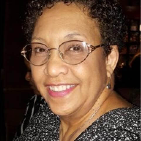
Person Style
Person style cards are useful for displaying headshots of faculty/board/etc. Whenever possible, the Profiles widget should be used instead, this is mainly to accommodate people who do not have profiles on profiles.howard.edu.

Person One
Title/etc.